On the tiny, subversive
ways of being
that burn through the
status quo.
≈ 3,200 words · about a 16 minute read
i.
The opening paragraph carries more weight than the rest. It is set in EB Garamond at 1rem on desktop, justified to a narrow column that spans six of the sixteen tracks. The column is deliberately uncomfortable for a screen — about thirty-eight ems — because that is the width books have used for centuries and the eye knows the rhythm without being told.
Body paragraphs scale up to 1.25rem on mobile, where the column has to do more work. Hyphenation is on. Old-style figures are on. The first paragraph of a chapter does not indent; the rest follow with a bottom margin of one em. None of this is decorative — it is what a careful page does when no one is looking.
Links carry a hairline that animates from one corner on hover,
a quiet acknowledgment that something will happen if you
click. Inline code is gold-bordered and quiet.
The footnote marker is small and superscript1.
The premise this template inherits, then, is the printed page — or more precisely, the printed page as it was understood in the centuries before the magazine, before the broadsheet, before the screen. A book trusts its reader. It does not provide hover states or progress bars or estimated reading times. It sets a column, fills it with type, turns the page, and asks nothing further. The whole apparatus is invisible because it works.
The web inherited none of that, and then spent thirty years half-remembering it. Stylesheets borrowed from print, then forgot why. Columns widened to fill viewports built for software. Justification was dropped because early browsers could not hyphenate, and never quite returned. We arrived at a default essay format — full-bleed gray on white, system font, eighty-character measure, no figures — and we called it neutral. It is not neutral. It is the residue of a series of compromises made for reasons that mostly no longer apply.
A section break uses a section-sign glyph centered over a hairline rule. It is calmer than asterisks and more articulate than empty space. Use it between paragraphs that belong to the same chapter but argue different points; use the chapter break, with its counter and display title, between movements of the argument.
The distinction matters because pacing is most of what reading actually is. A paragraph break is a breath. A section break is a pause. A chapter break is a turn. The reader's body follows the marks; an essay set without them — a single three-thousand-word slab — asks the reader to do all the pacing themselves, and most readers, given that ask, simply leave.
The hardest part of a designed essay is choosing which sentence deserves to be larger than the others.
ii.
Chapter heads use Cormorant Garamond at clamp(4.5rem, 12vw, 7.75rem) with negative tracking. The italic span is set in a muted gray, a typographic move borrowed from titles in mid- century book design: the noun stays black, the adjective whispers. The effect, like most good typographic effects, is barely visible until the alternative is shown next to it.
Between chapters, the section sign and hairline mark a pause. Within chapters, paragraphs flow tight against one another, a single em apart. The page wants to be read straight through. It will permit you to leave at any time — every chapter is its own anchor — but it does not invite leaving.
A framed aside sits inside a hairline rectangle, its label notched over the top edge.
The aside above is reserved for sentences that need to land outside the argument's flow — a definition, a confession, a disclaimer. The hairline frame and notched label come straight from book chapter openers and from the title-page conventions that book chapter openers learned them from. The convention is older than the typewriter; it is older than the steel pen. It survived because it does one thing well, which is to make a reader stop without making a reader anxious.
The web's equivalent — the callout box with a coloured left border and an icon — does the opposite. It alarms. It interrupts. It announces that what follows is more important than what came before, when in fact what follows is almost always less important. Disclaimers, definitions, asides — these are less important by definition, which is precisely why they need to be set apart. The hairline frame admits this; the colored bar does not.
A small distinction, perhaps, but the small distinctions add up. A page that is full of devices shouting for attention is a page that has nowhere left to put emphasis. A page whose devices whisper has somewhere to go when it wants to raise its voice.
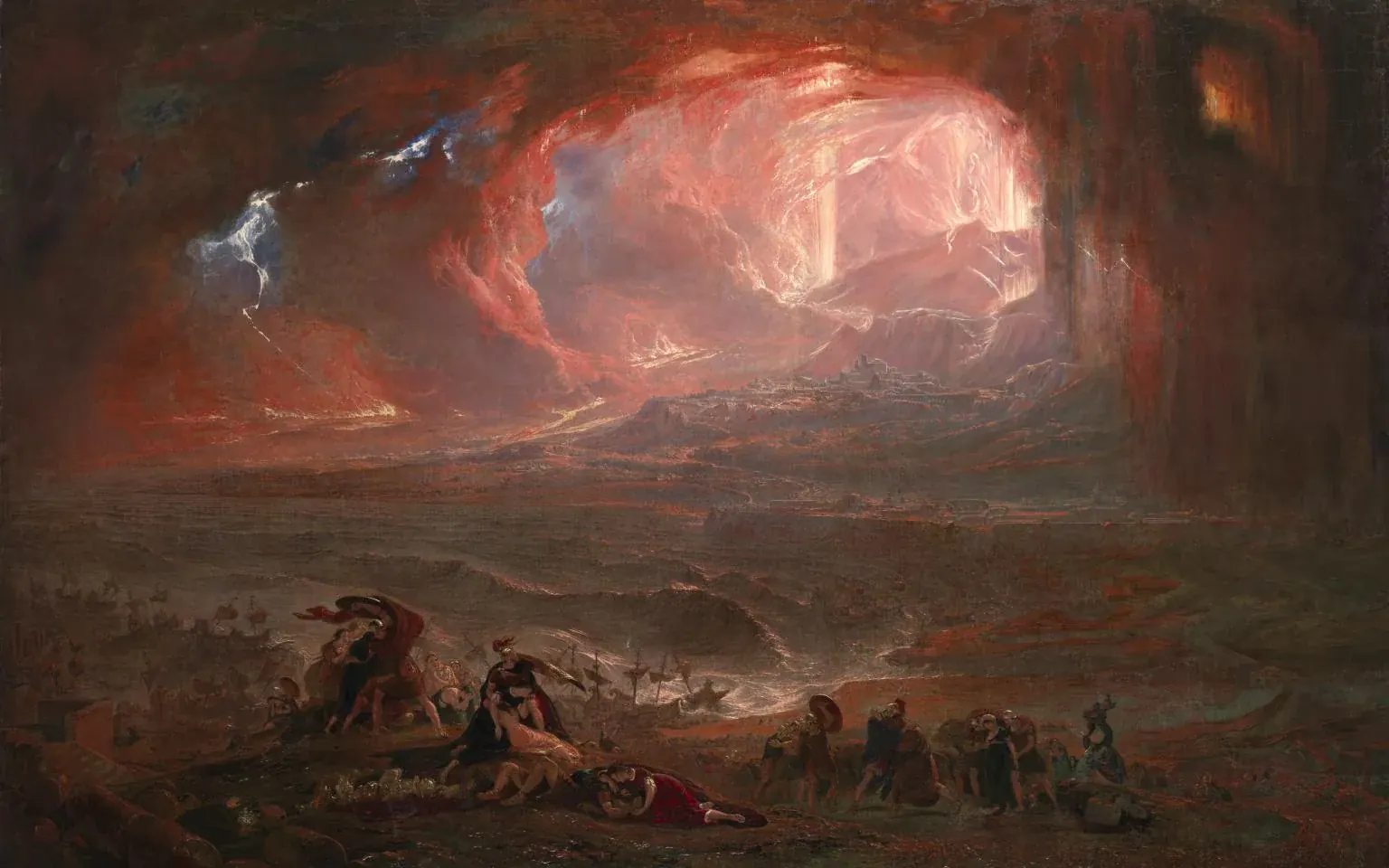
Figures appear next, with right-aligned italic captions in a smaller size and softer ink — a quotation from the page grammar of journals and academic monographs, never magazines. The caption is not the figure, and the typography reflects that. It is meta-text, attached to the figure but standing apart from it.
iii.
Chapter three opens with the dramatic move: an image hero with the chapter counter and title set in white over a darkened photograph. The image is dimmed via a brightness filter so the type holds its shape regardless of the underlying content. The text-shadow is small and dark; it does the last five percent of work that the brightness filter cannot.
Use this pattern once or twice in an essay, never more. The effect comes from the contrast with the quieter chapters around it; deploy it too often and it stops marking anything. The same lesson applies to drop caps, ornament rules, vertical type, and every other typographic device that calls attention to itself: scarcity is the source of their power.
After the hero, the essay returns to ordinary prose. The narrow justified column resumes as if nothing happened. This is the lesson of every great designed essay: the design is allowed to shout once or twice, and it has to earn it.
It is tempting, having built the apparatus, to use it everywhere. Every paragraph wants a pull-quote. Every chapter wants an image hero. Every aside wants its own frame. This is the failure mode of design systems on the web — once a component exists, the path of least resistance is to deploy it. The discipline of a designed essay is the discipline of not deploying.
The best test for whether a device belongs is to remove it and see whether the essay weakens. Most of the time it does not, and the device should stay removed. Occasionally — once or twice — the essay genuinely needs the lift, and that is exactly when the device pays for the whole apparatus that supports it.
A page that does not announce its design is the only page worth designing.
iv.
The column is the heart of the page, and on the web the column is almost always wrong. A measure of eighty characters, the default of nearly every blogging platform, is too wide for the eye to track at one rem; the reader's gaze loses its place at the line break and the brain has to do an extra job to find the start of the next line. The page reads as exhausting before the reader can articulate why.
Books have known this for five hundred years. The width of a column is set by the width of the reader's gaze; the width of the gaze is set by the size of the type and the depth of the leading. Typeset books — even mass-market paperbacks — almost never exceed sixty-six characters per line, and the best of them sit closer to fifty-five. The width is not arbitrary; it is the result of a small constraint optimization the typesetter performs each time, and the result tends to fall inside a narrow band because the underlying biology is the same.
The template's measure is sixty-three characters on desktop, justified, with old-style hyphenation. On mobile, where the column must accommodate a thumb, the measure shortens and the type grows; the ratio of size to measure stays roughly constant. None of this is visible to the reader. The reader simply gets to the end of the essay without the small fatigue that comes from working harder than the type deserves.
A column also has a vertical rhythm. Paragraphs are separated by one em, which is to say, by exactly the height of the type itself. This produces a column whose spaces match its substance — the silence between sentences is the same size as the sentences. It is a very old idea; it works because it is so old that the eye no longer notices it.
The other rhythm is the line-height, set here at about 1.5 — generous for the screen, normal for a book. The leading determines how much air the column carries. Tighter leading makes the column denser and asks the reader to commit; looser leading makes the column lighter and lets the reader breathe. The choice is rhetorical. A polemic might use tighter leading; a meditation might use looser. This template uses a middle setting because the template is neither.
Where the column sits on the page is also a choice. The template offsets the column to the right of the grid on desktop, leaving a wide left margin for chapter heads, figures, and aside material to occupy without disturbing the read. The asymmetry is borrowed from scholarly editions of medieval manuscripts, where the marginal apparatus carries as much weight as the text. The web's default — column centered, gutters equal — flattens this distinction.
v.
The page has a grammar in the same sense that a sentence has a grammar: a small set of relationships that, once learned, the reader does not have to think about again. The section sign means pause within a chapter. The chapter heading means new movement. The pull-quote means this sentence is the one to remember. The framed aside means this sentence is parenthetical. The italic span in the title means modifier. The right-aligned caption means this is not the argument.
A reader who has read three or four pages of this template has, without noticing, learned its grammar. Now the work of design recedes, and the work of reading begins. This is the goal — not for the design to be admired, but for the design to disappear into use2.
The corollary is that the grammar must be consistent. If the section sign means pause within a chapter on page two, it cannot mean new chapter on page seven. If the framed aside is reserved for definitions, it cannot suddenly hold a quote. The reader has not read the stylesheet; the reader is inferring the rules from instances, and any inconsistency forces the inference to start over.
This is also why the page resists novelty. A new typographic device, introduced midway through an essay, is a new grammatical category, and the reader has to learn it on the spot. Most of the time this learning is not worth it. The eighteenth-century novel got along on something like a dozen typographic devices for hundreds of pages. The case for a new device, on the web, in this century, has to be substantially better than that.
A useful exercise: list every typographic device the template uses, and ask what each one is for. The masthead announces the piece. The table of contents announces the shape. The chapter hero announces a movement. The section sign announces a pause. The pull-quote names the sentence to remember. The framed aside holds parenthetical material. The figure shows what cannot be said. The footnote marks what the argument prefers to whisper. The fin glyph announces the end. Nine devices, each with a single job. Add a tenth and the page begins to fray.
Grammar: a small set of relationships the reader stops noticing.
Note that the framed aside reappears, and that the reader does not need a key to know what it means. That is the test: the second occurrence should land without explanation. If it does not, the device is not yet grammar — it is still ornament.
vi.
A page is made of materials, and the materials matter. The body is set in EB Garamond, a careful free revival of the type Claude Garamont cut in Paris in the sixteenth century. The display is set in Cormorant Garamond, a more expressive interpretation of the same letterforms with sharper terminals and a more pronounced italic. Together they share a family resemblance — a quiet roman and an emphatic display — without falling into the trap of using two unrelated faces and hoping the reader will not notice.
The paper is warm. The background is a low-saturation cream,
#eae8e1, that is almost but not quite white. The
ink is a deep near-black, #32332e, just warm
enough to not feel like a paint chip. The accent — used only
for code and for numbered markers — is the gold of a
hand-coloured initial, never saturated, never loud. The total
palette is four colours: paper, ink, hairline, gold. Add a
fifth and the page begins to feel like a website again.
The fonts are loaded from a public CDN because that is the path of least resistance. In a more rigorous production we would self-host the woff2 files, subset them to Latin-1, and serve them with appropriate cache headers. The reader would not notice; the reader's network would. This is the kind of work that distinguishes a careful page from a beautiful one — beauty without care is decoration.
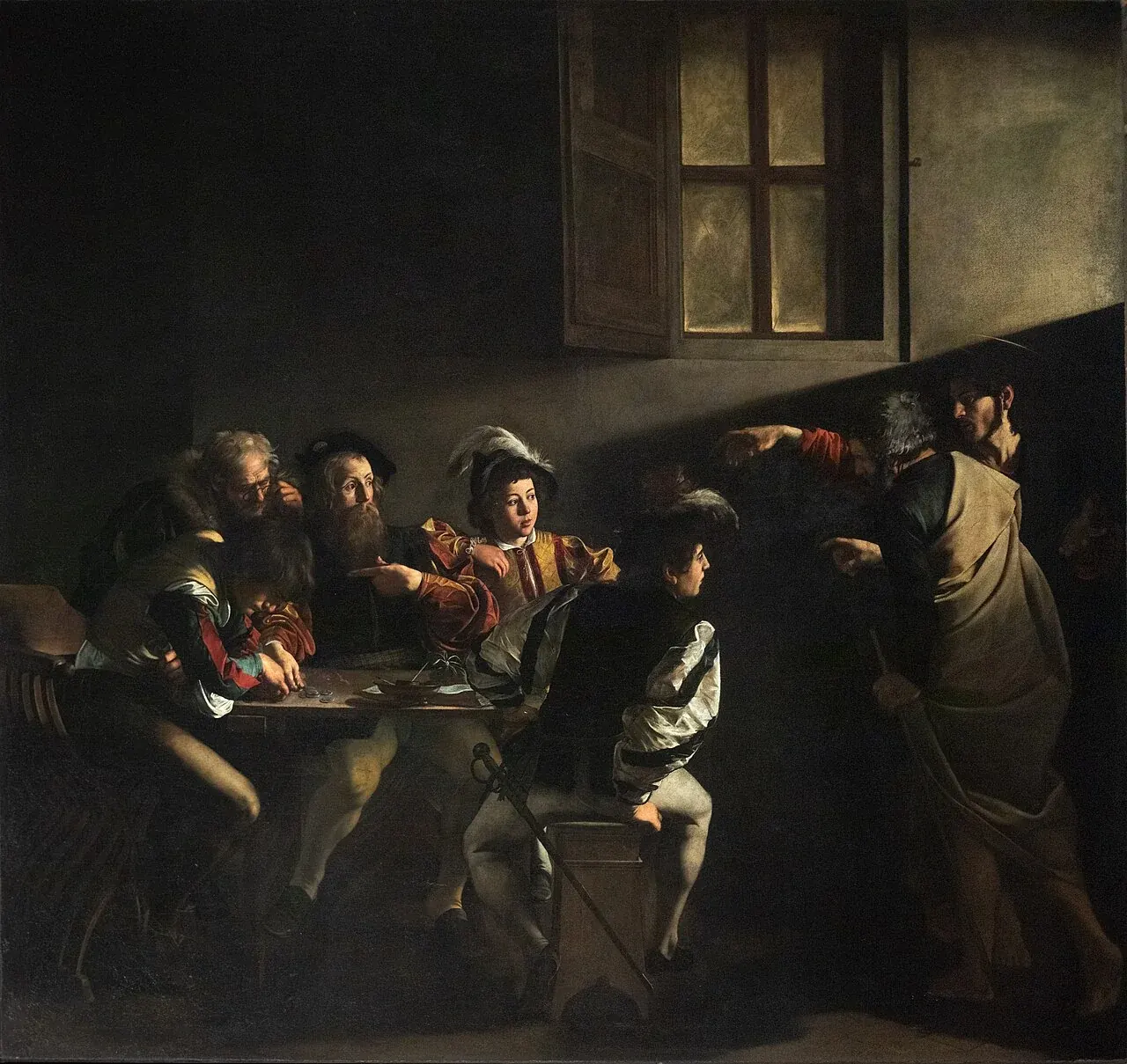
The masthead image is a Renaissance painting because a Renaissance painting is a kind of typographic argument made in another medium: a small number of figures, set in a composed space, with the negative volume doing as much work as the positive. The choice of image is not incidental. A contemporary photograph in the masthead would shift the register of the entire essay; a corporate stock image would collapse it. The reader is not asked to know the painting, only to feel the year it was made.
Materials extend past type and image to the smaller things:
the hairline border at #c5c5ba, calibrated to
sit against the cream without disappearing; the selection
colour, a low-opacity warm gray that does not fight the
paper; the focus ring, a dashed outline at the same hairline
colour rather than the browser default's electric blue. None
of this is heroic. All of it accumulates.
A medium is also a choice about what kind of attention to ask for.
vii.
The most serious objection to this kind of essay design is that it is anachronistic, and the anachronism is the point. We do not actually read this way anymore. Long-form on the web has settled into the medium scroll: full-bleed, sans-serif, fifteen-pixel system stack, no figures, no chapter breaks, three thousand words of grey-on-white. The medium scroll works. It is not pretty; it is not careful; it is not designed; but it works.
The case for the designed essay is not that the medium scroll fails. It is that it succeeds at one thing — getting the words from the author to the reader with no friction — and that occasionally one wants more than that. One wants a piece of writing to feel like a piece of writing, not a piece of content. One wants the form to communicate that the words were chosen, that they are meant to be read carefully, that the writer believed they were worth setting.
The objection then becomes: but why bother on the web? Why not write a book? The answer is that the book has gatekeepers and the web does not, and that the case for the designed page is exactly as strong as the case for caring about your work outside the channels that demand you care. A poem on a napkin is still a poem; a designed essay on a personal site is still an essay. The audience is small. That is fine.
A subtler objection: the designed essay is a flex, an attempt to make the form upstage the argument. There is some truth to this. A page that calls attention to itself risks calling attention away from what it carries. The answer, again, is restraint. The masthead is loud; the column is quiet. The chapter heroes are loud; the chapter bodies are quiet. The pull-quote is loud; the paragraph around it is quiet. The page earns its loud moments by being quiet most of the time. A page that is loud throughout is a page that is not designed at all — it is just decorated.
And the third objection, the practical one: this is a lot of CSS for something that could be a Markdown file. It is. Roughly six hundred lines of CSS sit behind any chapter of this essay, which is more code than most readers will ever see. But the same six hundred lines support the next essay, and the one after that, and the writer never has to think about them again. The cost is amortized; the discipline is preserved; the form is available the moment the writer wants to reach for it.
viii.
The final chapter answers — or, better, complicates — the question the opening posed. There is no “Conclusion” heading. The reader knows the essay is ending because the pace slackens and the sentences shorten.
The closing typography matches the opening typography. The last line of the essay is its own paragraph, set without any ornament, followed only by the fin glyph and a quiet link home. The page does not thank you for reading. The fin is the thanks.
A template is a wager about the future. This one wagers that long-form on the web is worth designing as if it mattered — not because every essay deserves the apparatus, but because some do, and because having the apparatus on hand makes the choice possible. The medium scroll is always available. So is this.